Scoping OMS Performance Data in Power BI
when working on a dashboard or a portal, sometimes it is good that the portal is more interactive. I often found it’s more useful then just a static widget. Since I come from the monitoring back ground, I’ll use performance data as an example.
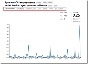
In the good old SCOM, we have this awesome 3rd party web portal called Squared Up, which allows you to choose the time frame for the perf graph:
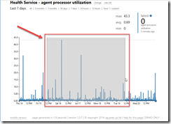
and you can also select the time frame by highlighting a section from the graph itself:
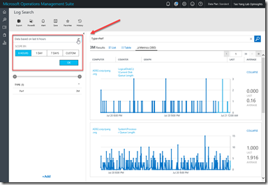
In OMS, when we are playing with the Near Real-Time (NRT) Performance data (Type=Perf), we also have the options to specify the time frame of our choice:
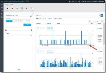
Additionally, if we have chosen a time scope that is 6 hours or less, we are able to see the raw NRT perf data coming in every few seconds (in light blue colour):
Both Squared Up (for SCOM) and OMS portal provides very interactive ways to consume the perf data.
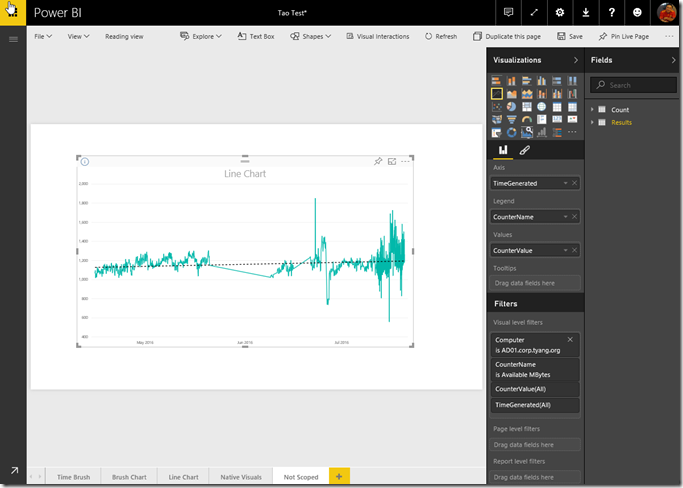
As we all know, OMS has the ability to send collected data to Power BI, therefore we are also able to create Power BI reports that contains performance data injected by OMS. i.e.:
As you can see, with the Power BI Line Chart visual, we can even add a trend line (the black dotted line), which is very nice in my opinion. However, by using native visuals, there are few limitations with displaying performance data in Power BI:
- The time frame cannot be easily scoped
- The computer and performance counters cannot be easily scoped
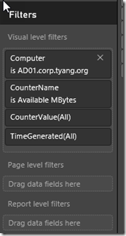
What I mean is, you can absolutely create a filters on either visual level, or page level or even the report level to create desired scopes – just like what I did in the example above:
But these filters are rather static. You won’t be able to alter them once you’ve saved the report. Obviously, as the report creator, you don’t really want to multiple almost identical visuals for different counters for different computers. In my opinion, reports like these become less interactive and user friendly because they are too static.
So, how do we make these Power BI reports more interactive? there are few options:
1. Use a Slicer to filter the computers OR the counters
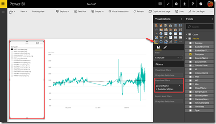
In Power BI, you can add a slicer to your page. Slicers makes the report more interactive. users can choose one or more items from the slicer and other visuals on the page will be updated automatically based on users selection.
In the above example, I’ve used page level filter to only display the ‘Availability MBytes’ counter, and users can use the slicer to choose the computers they are interested in.
This solution is easy to implement, it may satisfy the requirements if you are only interested in a specific counter from a long term trend point of view – since we are not filtering the time windows, it will display the entire period that is available in Power BI.
2. Use the Custom Visual ‘Hierarchy Slicer’ to filter the computers AND the counters
For Power BI, you can download custom visuals from https://app.powerbi.com/visuals/?WT.mc_id=Blog_CustomVisuals and then import into your reports.
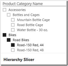
One of the custom visual you can download is called Hierarchy Slicer:
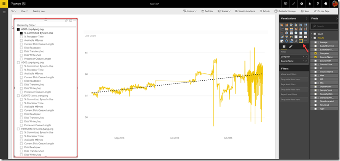
As the name suggests, comparing to the original built-in slicer, this visual allows you to build a hierarchy for your slicers:
As you can see, I’ve added Computer name as the top level filter in the hierarchy slicer, followed by the counter name as the second level in the slicer. As the result, I don’t have to use the filters for this page. Users can simply click on a counter (2nd level) to view the graph for the counter on that specific computer, or select a computer (1st level) to see all the perf data for that particular computer. Obviously, you can make the counter name as the top of the hierarchy and place the computer name as the second level if that suits your needs better.
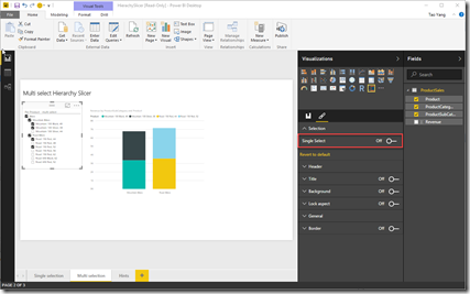
**Note: **As per introduction video for this visual, you can enable multi-select by configuring the visual and turn off the ‘Single Select’ option:
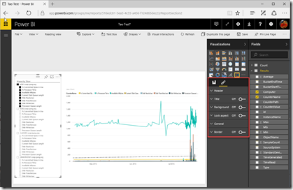
However, based on my experience, this option is only available when you are using Power BI Desktop. It is not available in Power BI Online.
Therefore we won’t be able to use multi-select for the OMS injected data because we cannot use Power BI Desktop with OMS data.
3. Use the Brush Chart custom visual to scope the time frame
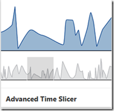
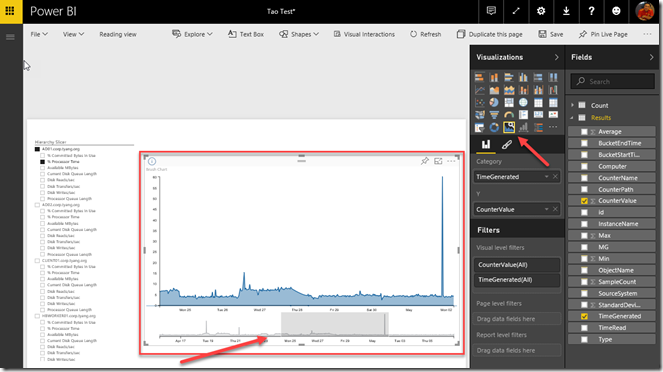
Another cool custom visual is called Brush Chart, it is also called ‘Advanced Time Slicer’ on the download page:
I am using this together with the hierarchy slicer, so I can scope both computers and counters, as well as the perf data time window.
As you can see, there are 2 graphs on this visual. I can use mouse (or other pointing devices) to select a time window from the bottom graph, and the top graph will be automatically zoomed into the selected time period.
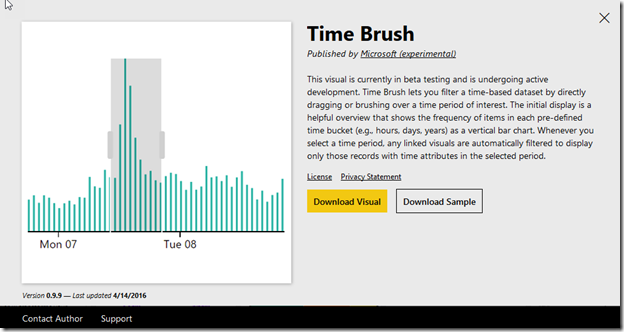
4. Use the Time Brush Custom Visual to scope the time frame
The Time Brush custom visual is very similar to the Brush Chart (aka Advanced Time Slicer).
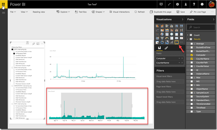
It cannot be used by itself, it acts as the control for other visuals. in the example below, I’m using it together with the Line Chart visual, as well as the hierarchy slicer:
As you can see, when I select a period from the Time Brush visual, the line chart got updated automatically.
5. use other custom visuals
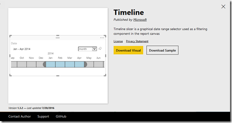
There are a lot of other custom visuals that you can download. for example, there’s another time slicer called TimeLine that allows you specify a precise, specific time frame.
Conclusion
By using the combination of various slicers, we can produce more interactive and user friendly reports in Power BI. In the examples listed above, I can quickly produce a single report for ALL the OMS performance data, and users can simply choose the computer, counter and the time frame from the report itself. There is no need to create separate reports for different counters or computers.
I hope you find these tips useful, and have fun with OMS and Power BI!

Leave a comment