Visualising OMS Agent Heartbeat Data in Power BI
Introduction
Few days ago, the OMS product team has announced the OMS Agent Heartbeat capability. If you haven’t read about it, you can find the post here: https://blogs.technet.microsoft.com/msoms/2016/08/16/view-your-agent-health-in-oms-2/. In this post, Nini, the PM for the agent heartbeat feature explained how to create custom views within OMS portal to visualize the agent heartbeat data. Funny that I also started working on something similar around the same time, but instead of creating visual presentations within OMS, I did it Power BI. I managed to create couple of Power BI reports for the OMS agent heartbeat, using both native and custom Power BI Visuals:
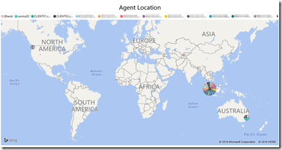
01. Agent Locations Map Report:
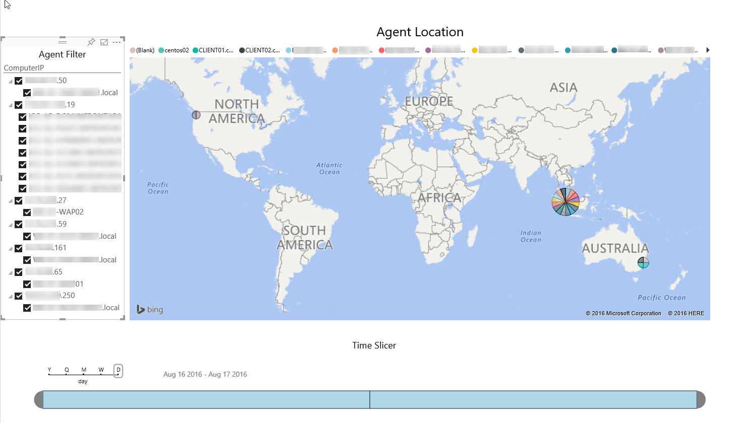
Since the agent heartbeat data contains the geo location of the agent IP address, I’ve created this report to map the physical location the agent on an interactive map.
02. Agent Statistics Report:
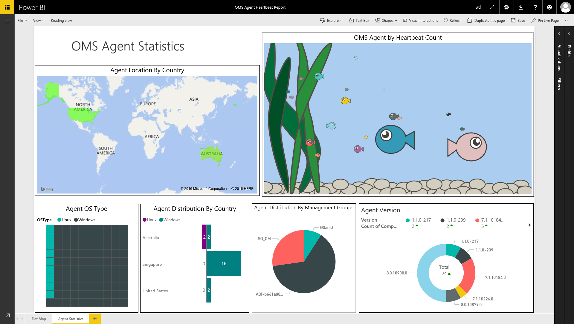
This report has several parts, it contains the following parts:
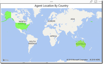
- A heat map based on the country where the agent is located (Agent Location by Country). The colour highlighting the country changes based on the agent count.
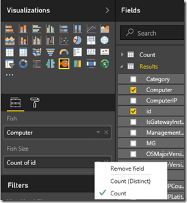
- An interactive “fish tank” visual. In this visual, each fish represent an OMS agent. the size of the fish presents number of heartbeats generated by the agent. So, the older the agent (fish) is, the more heartbeat will be generated to the OMS workspace (fish tank), and the bigger the fish will become.
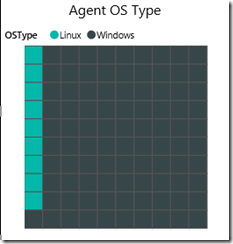
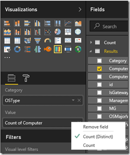
- A Brick chart shows the percentage (this chart contains 100 tiles) of the agent by OS type (Linux vs Windows).
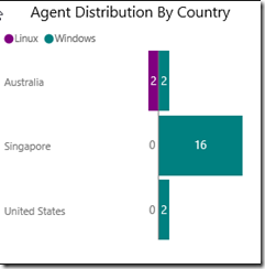
- A tornado chart shows agent distribution by country. Agent OS type is also separated in different colours.
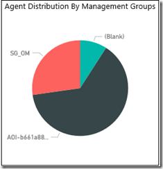
- A Pie Chart shows agent distribution by management groups (SCOM attached vs direct attached vs Linux agents)
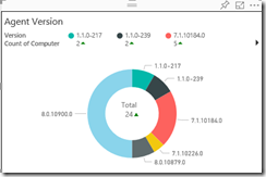
- Agent version Donut chart that separates agent counts by agent version numbers (both Windows agents and Linux agents).
The fish visual is called “Enlighten Aquarium”, as you can see below, it’s an animated visual.
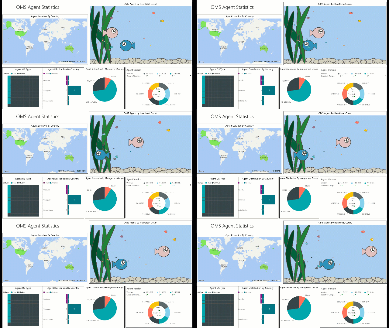
In this blog post, I will walk through the steps of creating these reports.
Instructions
Pre-Requisites
Before we create these reports, you need to make sure:
01. Power BI account
You will need to have a Power BI account (either a free or pro account) so OMS can inject data into your Power BI workspace.
02. Power BI preview feature is enabled in OMS
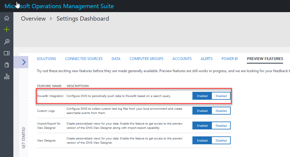
At the time of writing this post, the Power BI integration feature in OMS is still under public preview. Therefore if you haven’t done so, you will need to manually enable this feature first. To do so, go to the “Preview Features” tab in the OMS settings page, and enable “Power BI Integration”:
03. Connect your OMS workspace to your Power BI workspace.
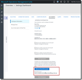
Once the Power BI Integration feature is enabled, you need to connect OMS to Power BI. This is achieved by providing the Power BI account credential in the “Accounts” tab of the OMS settings page:
04. Setting up Power BI injection schedules
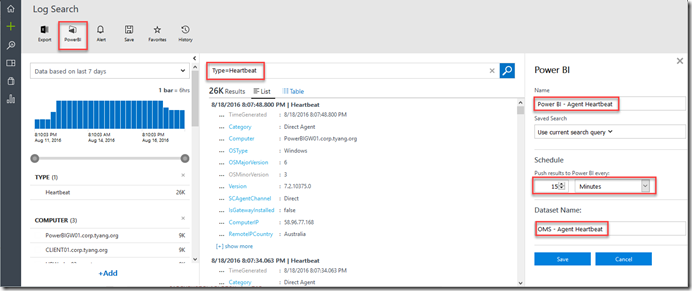
We need to inject the OMS agent heartbeat data to Power BI. We can just use a simple query: “Type=Heartbeat”, and set the schedule to run every 15 minutes:
05. Wait 15 – 30 minutes
You will have to wait a while before you can see the data in Power BI.
06. Download Power BI Custom visual
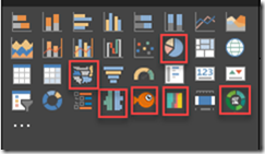
Since these reports use number of custom Power BI visuals, you will need to download them to your local computer first, and then import them into the reports when you start creating the reports. To download custom visuals, go to the Power BI Visuals Gallery (https://app.powerbi.com/visuals/) and download the following visuals:
- Brick Chart
- Hierarchy Slicer
- Donut Chart GMO
- Timeline
- Tornado Chart
- Enlighten Aquarium
Create Reports
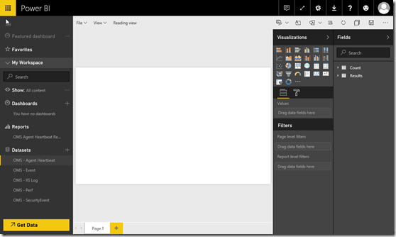
To start creating the report, firstly logon to Power BI using the account you’ve used to make the connection in OMS, and then find the Dataset you have specified. in this post, I’ve created a dataset called “OMS – Agent Heartbeat”. By clicking on the dataset, you will be presented to an empty report:
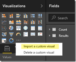
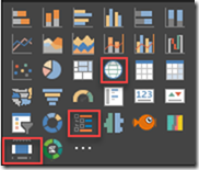
You will then need to import the custom visuals – by clicking on the “…” icon under Visualizations, and select “Import a custom visual”
You can only import one at a time, so please repeat this process and import all the custom visuals I have listed above.
Creating Agent Location Report
For the Agent location report, we will add 3 visuals:
- Hierarchy Slicer – for filtering IP addresses and computer names
- Map – for pinpointing the agent location
- Timeline – for filtering the time windows
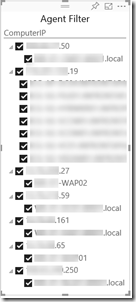
Agent Filter (Hierarchy Slicer)
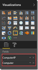
Add a Hierarchy slicer and place on the left side of the page, then drag the ComputerIP and Computer fields from to the “Fields” section, please make sure you place ComputerIP on top of Computer:
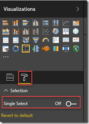
it’s also a good idea to turn off single selection for the hierarchy slicer so you can select multiple items:
Agent Location Map
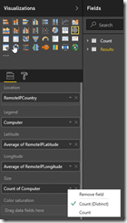
Add the Map visual to the report, configure it as listed below:
- Location – RemoteIPCountry
- Legend – Computer
- Latitude – Average of Remote IPLatitude
- Longitude – Average of RemoteIPLongitude
- Size – Count of Computer (Distinct)
Note: since the latitude and longitude shouldn’t change between different records for the same computer as long as the IP doesn’t change, so it doesn’t matter if you use average, or maximum or minimum, the result of each calculation should be the same.
Time Slicer (Timeline)
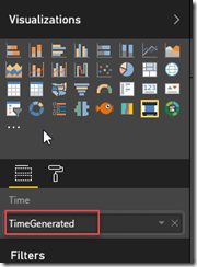
Add a timeline slicer to the bottom of the report page, configure it to use the TimeGenerated field:
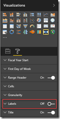
To same some space on the report page, you may also turn off the labels for the timeline slicer:
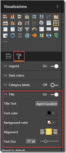
Lastly, add a text box on the top of the report page, give it a title, also if you want to, assign each visual a title by highlighting the visual, then click on Format icon, and update the title field:
To use this report, you can make your selections in the hierarchy slicer and the timeline slicer. The map will be automatically updated.
Create Agent Statistic Report
For the second report, you can create a new page of the existing report, or create a brand new report based on the same dataset. We will use the following visuals in this report:
- Filled Map
- Aquarium
- Brick Chart
- Tornado Chart
- Pie Chart
- DonutChartGMO
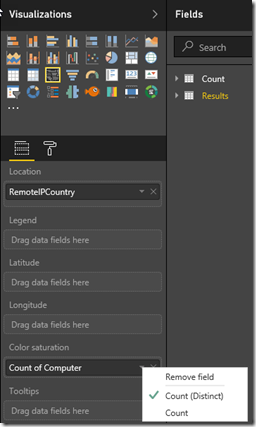
Agent Location By Country (Filled Map)
Configure the Filled Map visual as shown below:
OMS Agent By Heartbeat Count (Aquarium)
Configure the Aquarium visual as shown below:
Agent OS Type (Brick Chart)
Configure the Brick Chart visual as shown below:
Agent Distribution By Country (Tornado Chart)
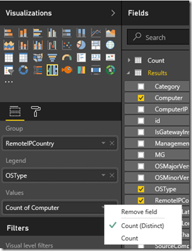
Configure the Tornado Chart as shown below:
Agent Distribution By Management Groups (Pie Chart)
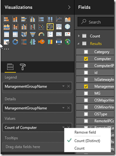
Configure the Pie Chart as shown below:
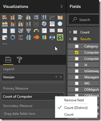
Agent Version (DonutChartGMO)
Configure the DonutChartGMO visual as shown below:
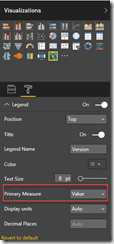
and change the Primary Measure under Legend to “Value” / “Percentage” / “Both”, whichever you prefer:
Most of the visuals used by this report are interactive. i.e. if I click on a section in the Agent Version DonutChartGMO visual, other visuals will be automatically updated to reflect the selection I made in the DonutChartGMO visual.
Once you’ve configured all the visuals, please make sure you save your report.
Conclusion
There are many things you can do with the Power BI reports you’ve just created. i.e. you can share it with other people, ping individual visuals or entire report to a dashboard, or create an Iframe link and embed the report to 3rd party systems that support IFrame (i.e. SharePoint sites). We are not going to get into details of how to consume these reports today.
Please note that during my testing, the RemoteIPLatitude and RemoteIPLongitude data from the heartbeat events are not very accurate for the computers in my lab. I’m based in Melbourne, Australia but the map coordinates pinged to a location in Sydney, which is over 1000km away from me.
Please also be aware that for SCOM attached agents, each time when the agent sends heartbeat, it will send 2 heartbeats via different channels. This behaviour is by design – my good friend and fellow CDM MVP Stanislav Zhelyazkov(@StanZhelyazkov) has explained this in his blog post: https://cloudadministrator.wordpress.com/2016/08/17/double-heartbeat-events-in-oms-log-analytics/
This is all I have to share for today. until next time, have fun with OMS and Power BI!



Leave a comment