OMS Network Performance Monitor Power BI Report
 I’ve been playing with the OMS Network Performance Monitor (NPM) today. Earlier today, I’ve released an OpsMgr MP that contains tasks to configure MMA agent for NPM. You can find the post here: https://blog.tyang.org/2016/08/22/opsmgr-agent-task-to-configure-oms-network-performance-monitor-agents/
The other thing I wanted to do is to create a Power BI dashboard for the data collected by OMS NPM solution. The data collected by NPM can be retrieved using OMS search query “Type=NetworkMonitoring”.
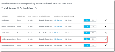
To begin my experiment, I created a Power BI schedule in OMS using above mentioned query and waited a while for the data to populate in Power BI
I then used 2 custom visuals from the Power BI Custom Visual Gallery:
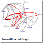
- Force-Directed Graph
- Timeline
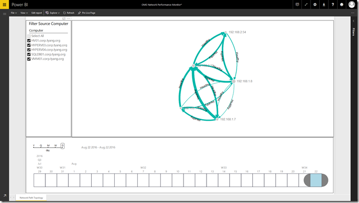
and I created an interactive report that displays the network topology based on the NPM data:
In this report, I’m using a built-in slicer (top left) visual to filter source computers and the timeline visual (bottom) to filter time windows. The main section (top right) consists of a Force-Directed Graph visual, which is used to draw the network topology diagram.
I can choose one or more source computers from the slicer, and choose a time window from the timeline visual located at the bottom.
On the network topology (Force-Directed Graph visual), the arrow represents the direction of the traffic, thickness represents the median network latency (thicker = higher latency), and the link colour represents the network loss health state determined by the OMS NPM solution (LossHealthState).
I will now explain the steps I’ve taken to create this Power BI report:
-
Create a blank report based on the OMS NPM dataset (that you’ve created from the OMS portal earlier).
-
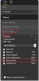
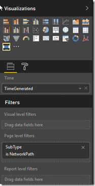
Create a Page Level Filter based on the SubType Field, and only select “NetworkPath”.
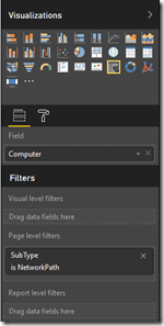
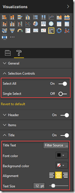
- Add the Slicer visual to the top left and configure it as shown below:
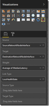
- Add the Force-Directed Graph (ForceGraph) to the main section of the report (top right), and configure it as shown below:
Fields tab:
- Source – SourceNetworkNodeInterface
- Target – DestinationNetworkNodeInterface
- Weight – Average of MedianLatency
- Link Type – LossHealthState
Format tab:
- Data labels – On
- Links
- Arrow – On
- Label – On
- Color – By Link Type
- Thickness – On
- Nodes
- Max name length – 15
- Size – change to a value that suits you the best
- Add a timeline visual to the bottom of the report, then drag the TimeGenerated Field from the dataset to the Time field:
As you can see, as long as you understand what each field means in the OMS data type that you are interested in, it’s really easy to create cool Power BI reports, as long as you are using appropriate visuals. This is all I have to share today, until next time, have fun in OMS and Power BI!


Leave a comment